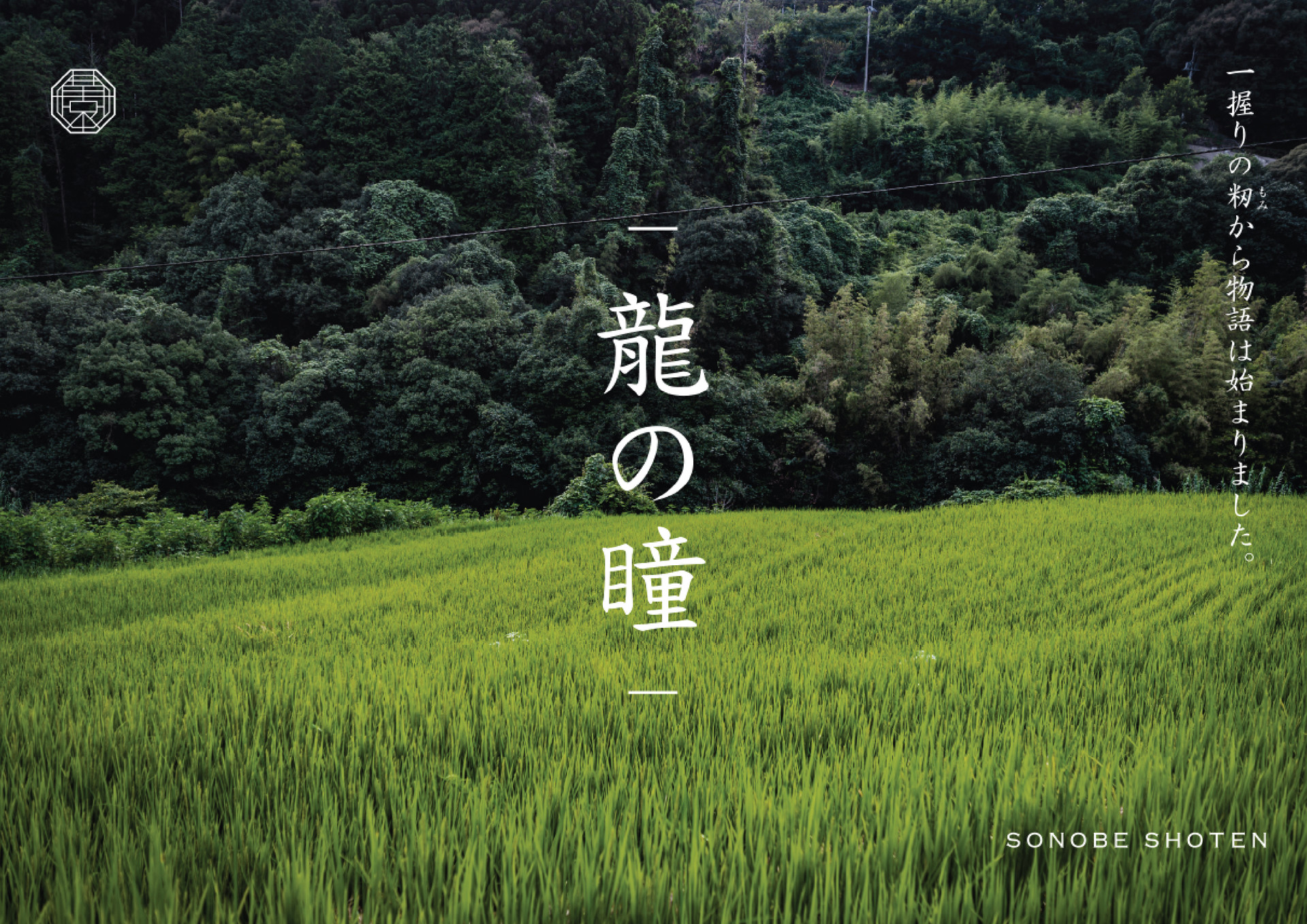
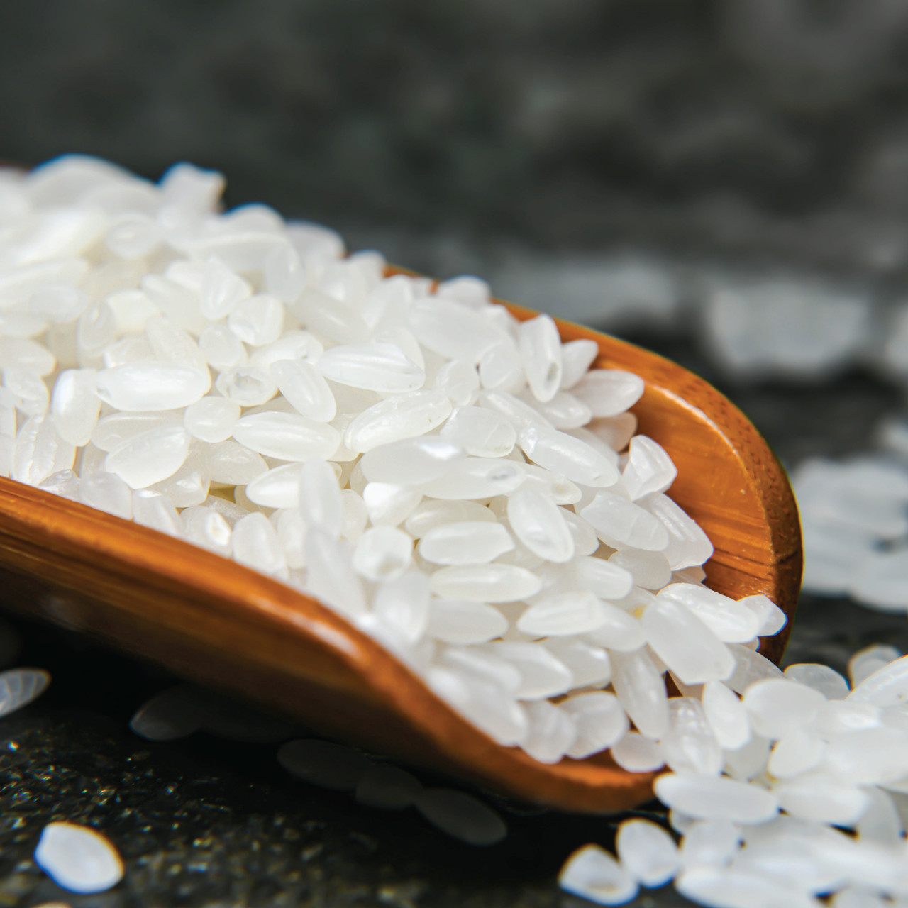
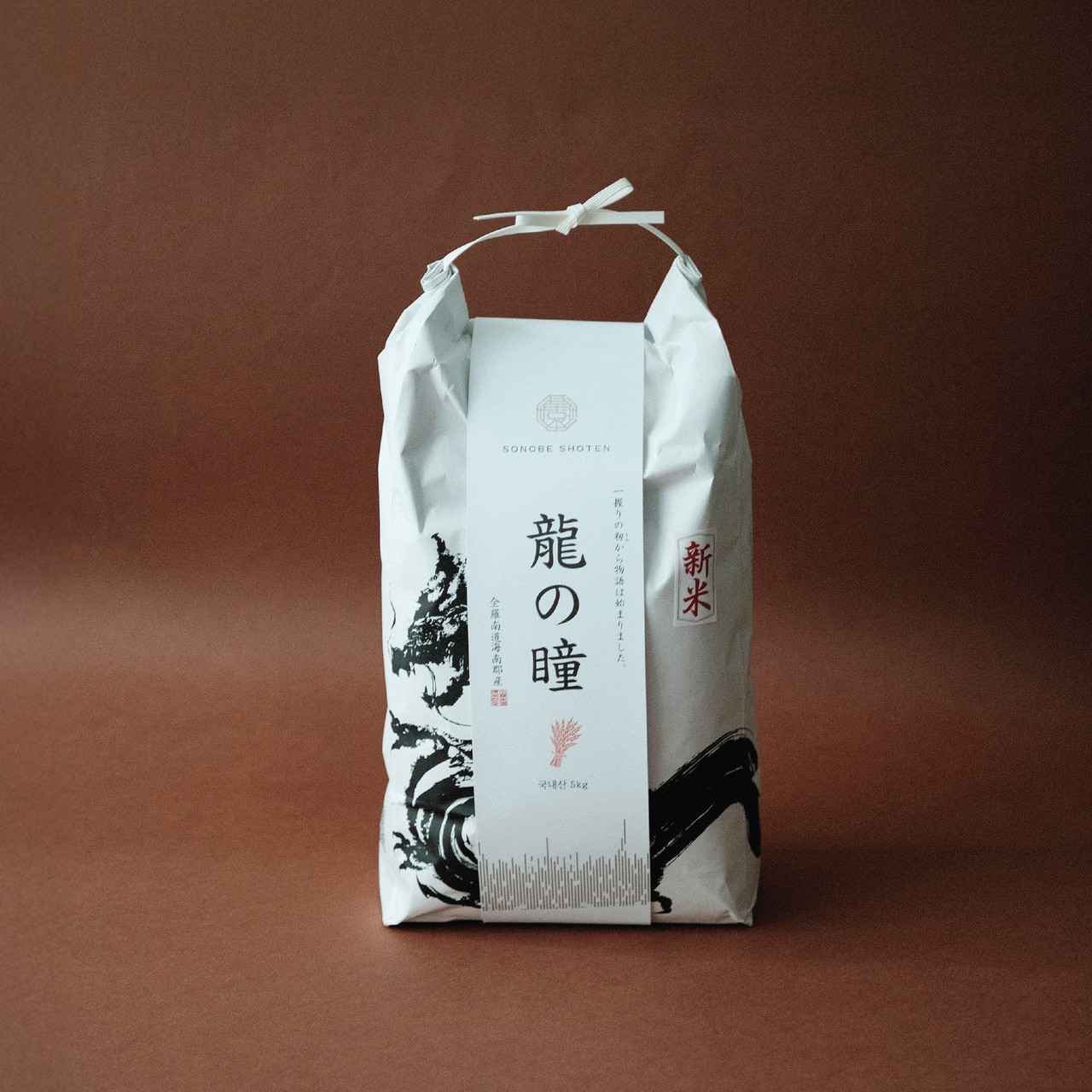
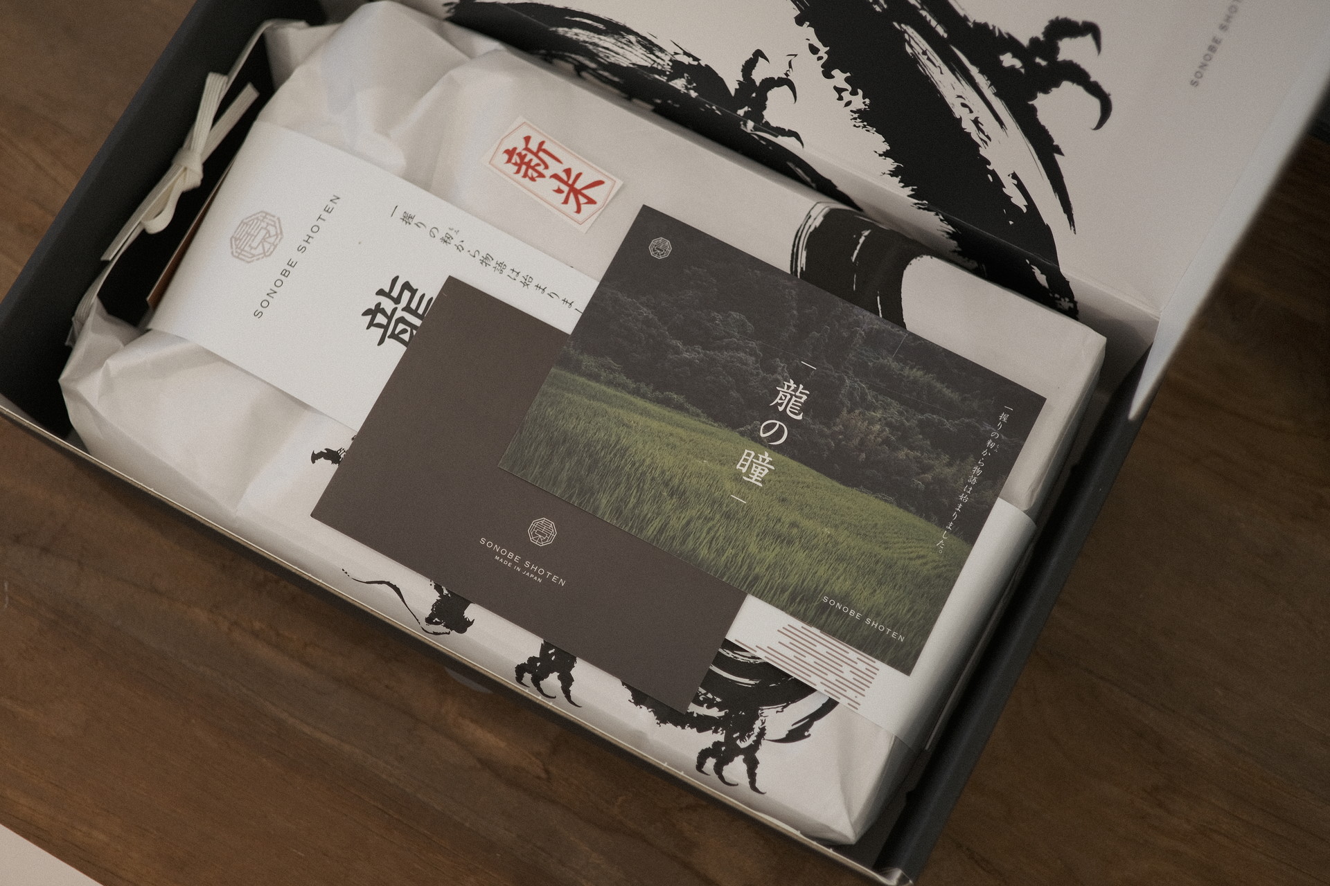
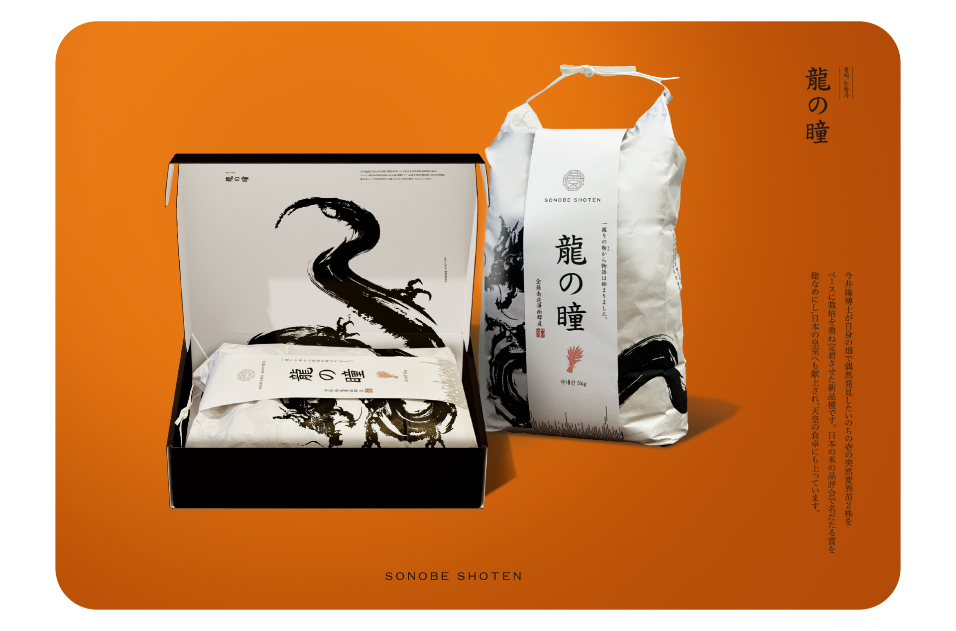
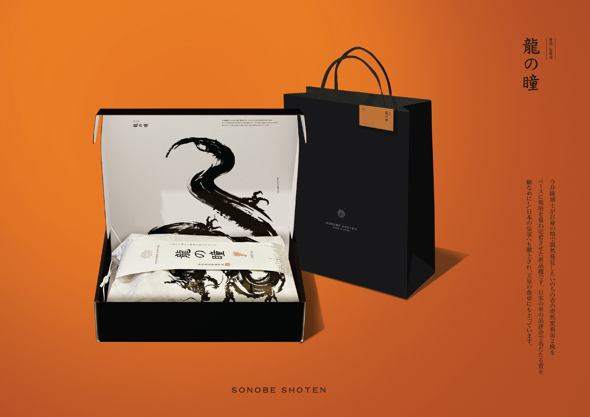
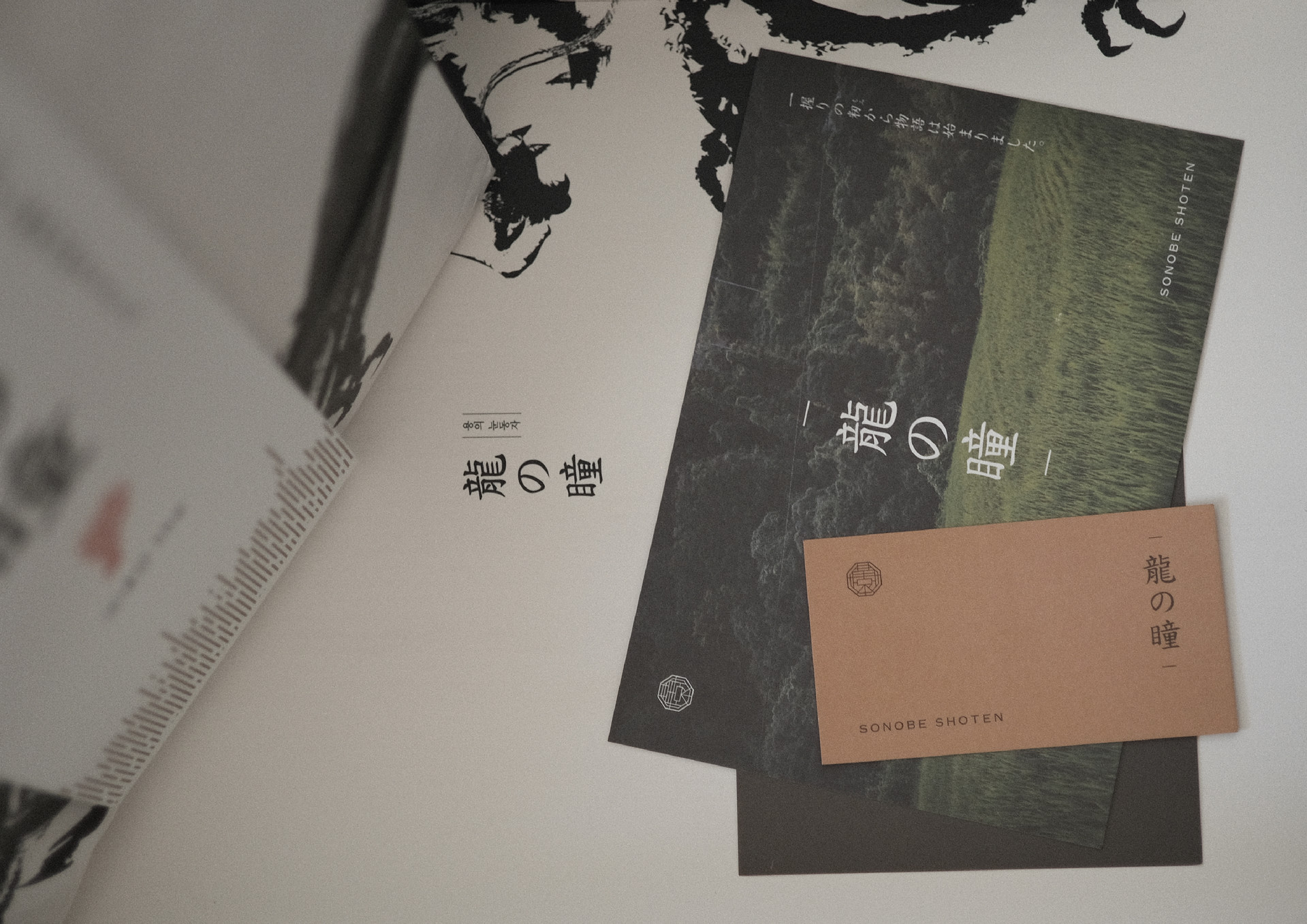
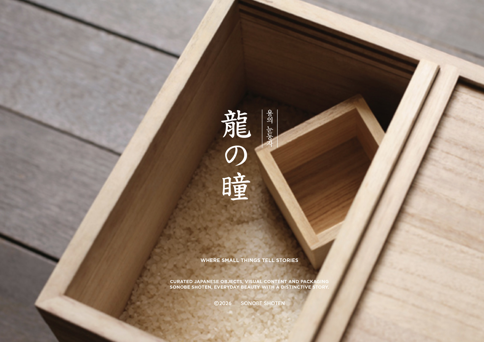
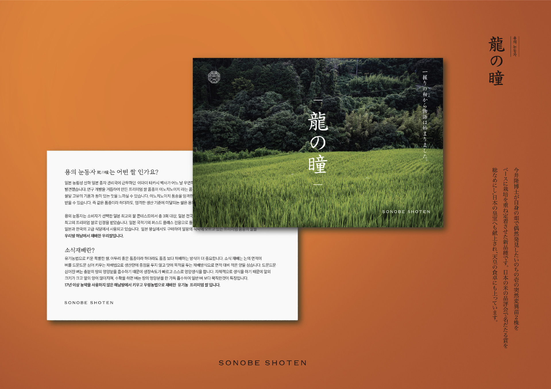
Tears of the Dragon is a premium rice brand developed through continuous improvements in cultivation methods, grain selection, and quality control. Created for department-store retail, the project required a visual identity that could express not only luxury, but also the agricultural knowledge, craftsmanship, and accumulated experience behind every grain.

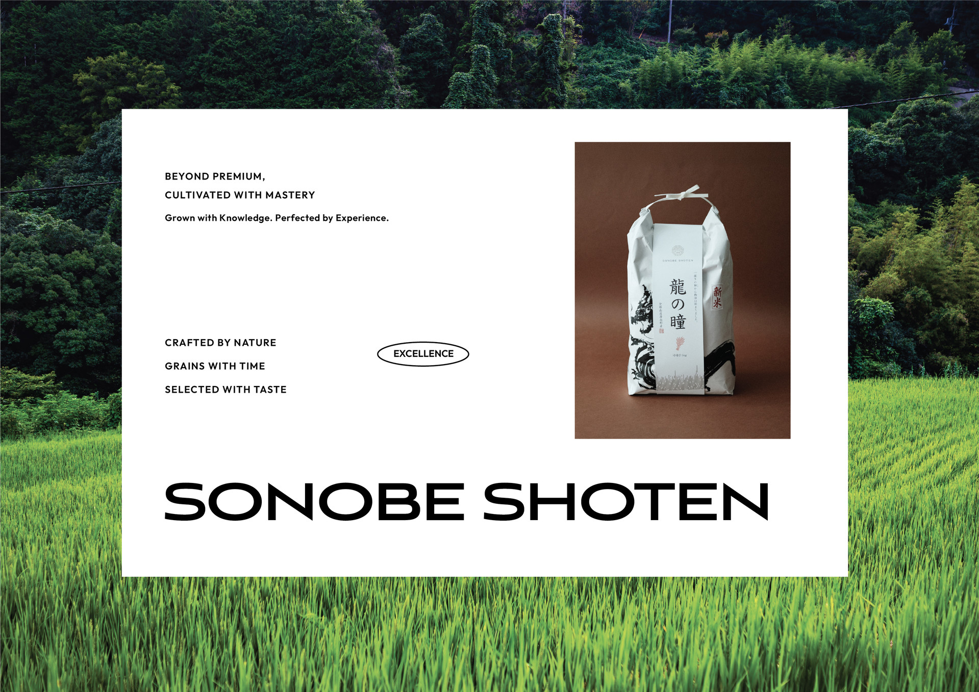
용의눈물은 단순히 고급스러운 이미지를 앞세운 쌀이 아니라, 농법과 품질 관리, 선별 과정의 지속적인 개선을 통해 완성도를 높인 프리미엄 쌀 브랜드입니다. 우리는 백화점이라는 판매 환경에 어울리는 품격을 갖추면서도, 한 알의 쌀에 담긴 생산자의 시간과 장인적 태도가 자연스럽게 전달되도록 패키지와 콘텐츠의 방향을 설계했습니다.


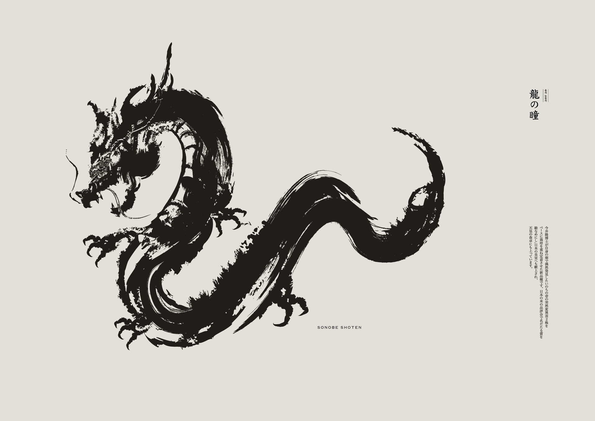
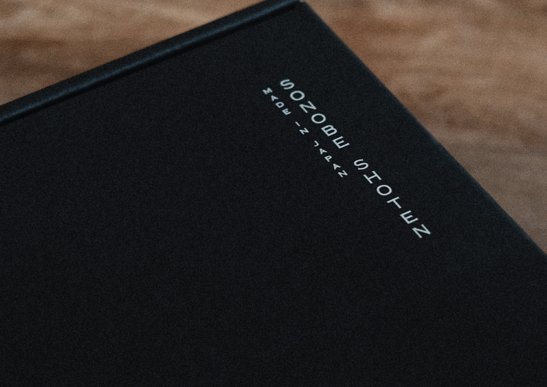
The packaging combines restrained typography, expressive imagery, and refined material details to present rice as the result of thoughtful cultivation rather than as a conventional agricultural product. Across both packaging and digital content, we established a consistent narrative of provenance, expertise, and uncompromising quality, positioning Tears of the Dragon as a distinctive premium choice within the department-store market.


Curating small objects and meaningful stories
for everyday life, both online and beyond.


Tears of the Dragon is a premium rice brand developed through continuous improvements in cultivation methods, grain selection, and quality control. Created for department-store retail, the project required a visual identity that could express not only luxury, but also the agricultural knowledge, craftsmanship, and accumulated experience behind every grain.

용의눈물은 단순히 고급스러운 이미지를 앞세운 쌀이 아니라, 농법과 품질 관리, 선별 과정의 지속적인 개선을 통해 완성도를 높인 프리미엄 쌀 브랜드입니다.

우리는 백화점이라는 판매 환경에 어울리는 품격을 갖추면서도, 한 알의 쌀에 담긴 생산자의 시간과 장인적 태도가 자연스럽게 전달되도록 패키지와 콘텐츠의

방향을 설계했습니다.


The packaging combines restrained typography, expressive imagery, and refined material details to present rice as the result of thoughtful cultivation rather than as a conventional agricultural product. Across both packaging and digital content, we established a consistent narrative of provenance, expertise, and uncompromising quality, positioning Tears of the Dragon as a distinctive premium choice within the department-store market.

mobile background

Recent Projects

Related Projects

For being awesome - style in Branding

LITTLE FOREST

overlapy@naver.coom

+82 010-9247-7350


© 2025 DESIGN LITTLE FOREST

For being awesome - style in Branding

LITTLE FOREST

overlapy@naver.coom

010-9247-7350

donggyo-ro, Mapo-gu, Seoul, Korea

© 2025 DESIGN LITTLE FOREST